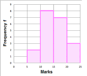

Frequency Diagrams and Frequency Polygons
When data is grouped with equal intervals, work out the midpoint.
A frequency diagram can be drawn then with the midpoint along the horizontal (x-axis) and the frequency along the vertical (y-axis)
A frequency polygon is formed by joining the midpoints of the tops of the bars in a frequency diagram.
- Example 1. Draw a frequency diagram and frequency polygon of the grouped data:
|
(a) For each range of Marks work out the midpoint x
|
(b) Frequency diagram
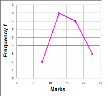
(c) Frequency polygon